Bud: Breast cancer support
Bud focusses on providing a softer, more personable source of breast cancer information and support. Many cancer information websites are clinical and overwhelming or draining to read at the best of times, let alone when concerned about breast health or dealing with cancer.
Bud aims to resolve this by breaking information down into more palatable and simpler formats. Bud’s aims to be accessible from home, to help people wherever and whenever they may need it.

Bud: prototype mockup
User research
Real user group interviews were carried out to establish issues which arose during the cancer, treatment, and recovery processes. The interview process highlighted that themes and problem areas for the interviewee were:
Communication
She struggled to communicate with her family and close friends out of wanting to keep a strong face. Feeling not properly understood by her peers with the struggles she faced emotionally and physically.
Information access
She found the doctors and staff she interacted with often were on a schedule, and diagnosis felt like a routine. This made appointments feel general, and not specific to her specific case. What is told in appointments is often forgotten due to shock. Information leaflets are given, but they are not very useful.
Because of these findings, the user needs statements were based on both of these general concerns, then each persona profile expands on how these broad areas affect users in more specific instances.
Personas
Based on the interviews carried out personas were developed, pulling out key pain points, user needs and goals. From these, user journeys and page flows to meet these needs have been created.

Persona 1: Clare

Clare user journey

Page flows for Clare
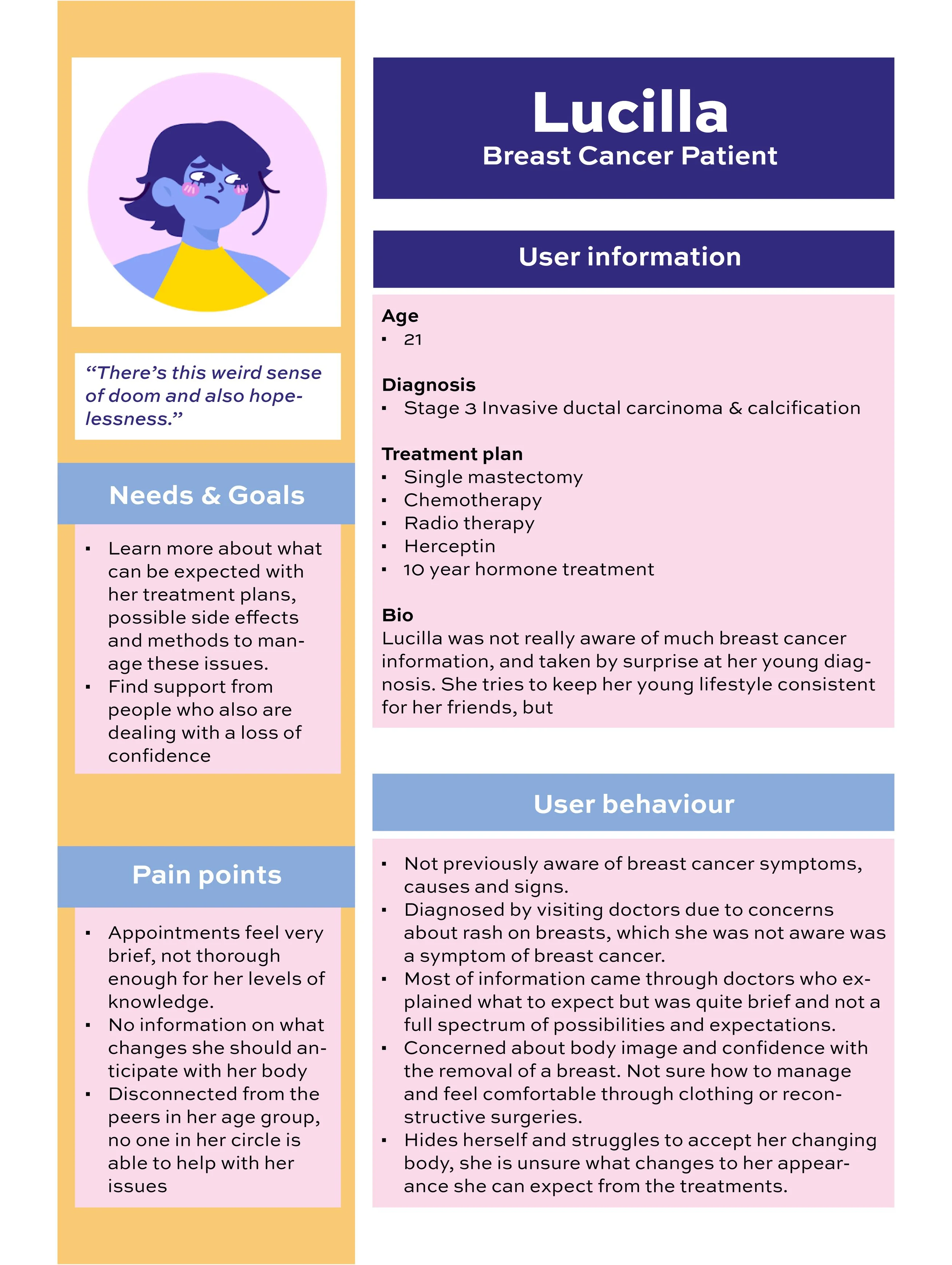
Persona 2: Lucilla

Persona 3: Cynthia
Site map
Part of the importance of the web-app is to reduce information overload for the likes of users like Cynthia. In keeping the sections of the site simple, the depth of the web-app is not too confusing, and prevents the user from feeling lost in the site. Filters reduce the scope of pages down further.

Expected site map of site
User testing

Sketched wireframes
Real user group interviews were carried out to establish issues which arose during the cancer, treatment, and recovery processes. The interview process highlighted that themes and problem areas for the interviewee were:
Communication
She struggled to communicate with her family and close friends out of wanting to keep a strong face. Feeling not properly understood by her peers with the struggles she faced emotionally and physically.
Information access
She found the doctors and staff she interacted with often were on a schedule, and diagnosis felt like a routine. This made appointments feel general, and not specific to her specific case. What is told in appointments is often forgotten due to shock. Information leaflets are given, but they are not very useful.
Because of these findings, the user needs statements were based on both of these general concerns, then each persona profile expands on how these broad areas affect users in more specific instances.

Prototype used for testing
Test overview
This user test was carried out on a mobile device.
The user was asked to complete two tasks.
Find a support group chat for maintaining an active lifestyle during treatment
Find further information about chemotherapy
The user test did not verbally express any complaints or problems. But from assessing the way the tester used the prototype, I noticed the following themes.
Consistently accessing content through the burger menu – the buttons on the homepage were not used
Clickable elements took a couple times to hit properly.
Solutions:
Make buttons on the homepage more flashy
Larger and more descriptive buttons on the homepage so the user is not tempted to go through the burger menu. Ensure the user can understand how to complete their tasks in the least amount of clicks
Larger/ more comfortable size clickable items for mobile testing.
Variation of different means to getting support avaliable. Helps meet different user needs... if Cynthia wants to avoid feeling overwhelmed, she may benefit from 1–1 chats etc.
3 stage questionnaire filters down and specifies information exactly relevant to the user.
Chats are suggested to user based on their individual circumstances.
“Feels simple to work through. The two main pathways are clear. Easy to understand from the home page that this is about getting support or learning more.”
UI and Visual identity
Colours
The colour palette involves a mixture of bold, and pastel hues. The colour story intends to contrast the typical medical palettes for a warmer, and more approachable feel for the users. Doing so will encourage users to view information in a more gentle light.
Typography
The typography used, Sniglet and Asap, combine to be effective and legible for large elements of text, without appearing too formal on the whole. Sniglet compliments the style of illustraions used.
Illustration
Illustrations portray a positive relationship with breasts and people. The characters and flowers, adapted from vectors linked below, tie the ‘Bud’ name and goals together.
TRY IT OUT
TRY IT OUT
Final prototype walkthrough
Icons via UntitledUI.com (Free UI kits)